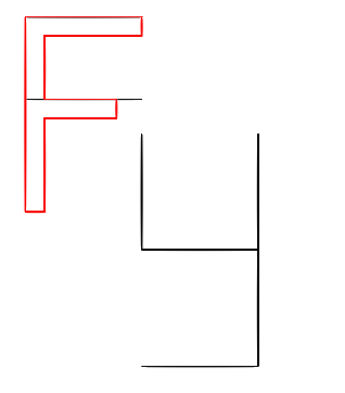
When someday I’m in PATH, I realized that “FY” can be organized like the arrangement below:
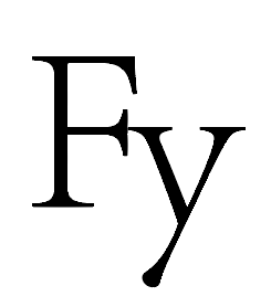
Basically Speaking, to align the head of “Y” into the middle line of F is just a thinking, I’m not sure if it is possible to make it looks good. Since I failed before using something like a handwriting style.
In order to make the LOGO better, I decided to make some requirement for the LOGO, just as:
- Tidy and Simple
- Looks like a Geek Style
To make that, it hints me that I can use staffs like toothpick to make the words, just like the words below:
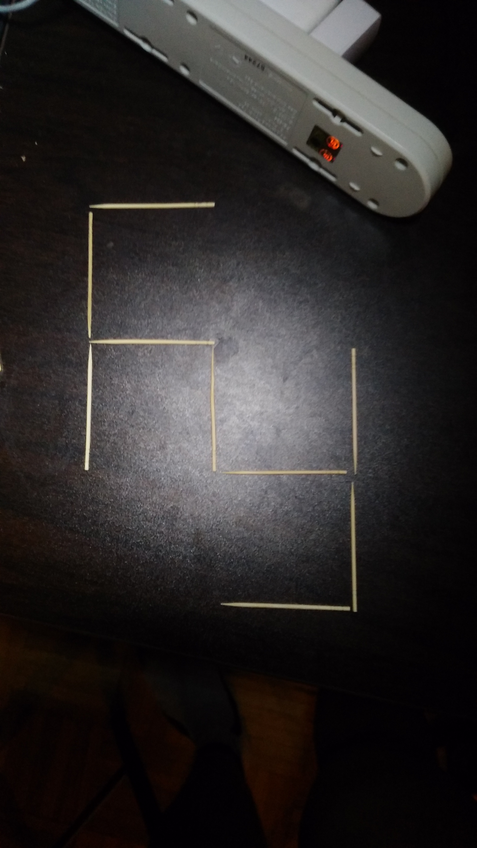
Looks quite elegant right? So based on that, I made a very fast prototype:

The size of the Character seems quite strange, so at first I just arrangement every stick as the same size, as below:
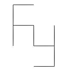
However, it still seems quite strange. So here I use the Didot, to Compare the size of the words, In order to make the character not looks strange:
The arrangement looks like the below staff:
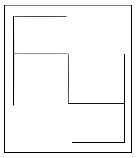
Looks Pretty better right?
After that, I decided to apply colors to that, if you want to make something looks Geek, the most important thing is to make the color like a code-green, likes the below one:

So here I applied something like that style:

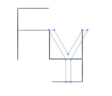
Ehh, ugly and stupid right? But here when I decided to applied the route together, I found it looks better if I doing things like that:

To link those two lines make things totally different. The two characters looks more like two pieces of puzzles here, make the LOGO more integrated, and more like a LOGO instead of only words.
If I still keep the Geek Green here, It is hard to find “FY”, so I applied a gradually changed colors below:
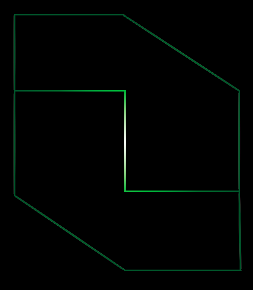
Though not so flatten as the popular design, it makes the whole parts with a metal texture, makes the LOGO more like Geek Feel. And I think it should be a stage-work for my LOGO design.