Actually in Manhattan, it is difficult to find a terrible sign all around the island. Since there are so many designers in New York, people will easily get a good design after hiring them. However, though most of the signs are beautiful here, some may not work so well, especially for public services. Here let’s have a look:
Passenger’s Button
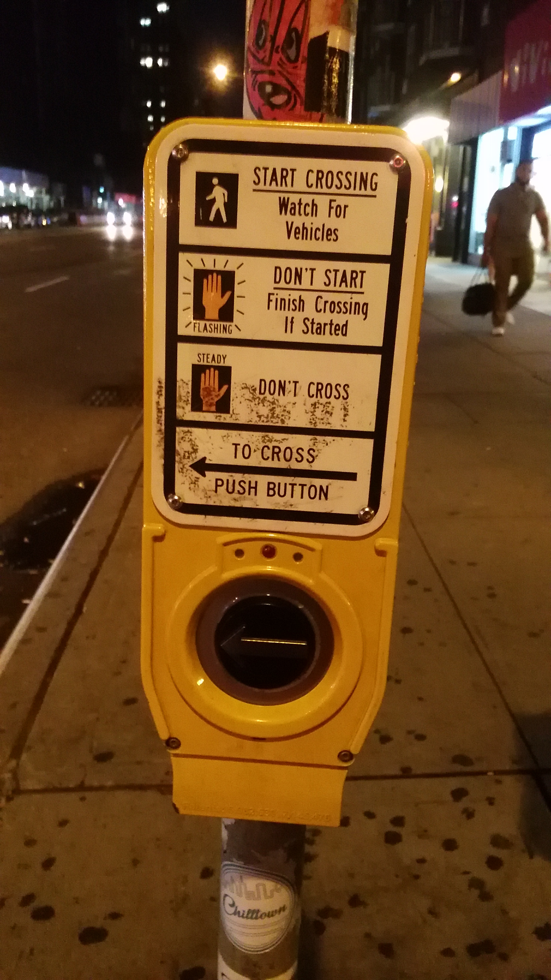
Though the picture is designed well, but the main function for this station is to require the passenger to push the button if they want to get across. “PUSH BUTTON” here is under all the staffs and easily be ignored. In fact no one will use this machine for Crossing.
Bicycle Forbidden Sign

Emergency-Report Machine
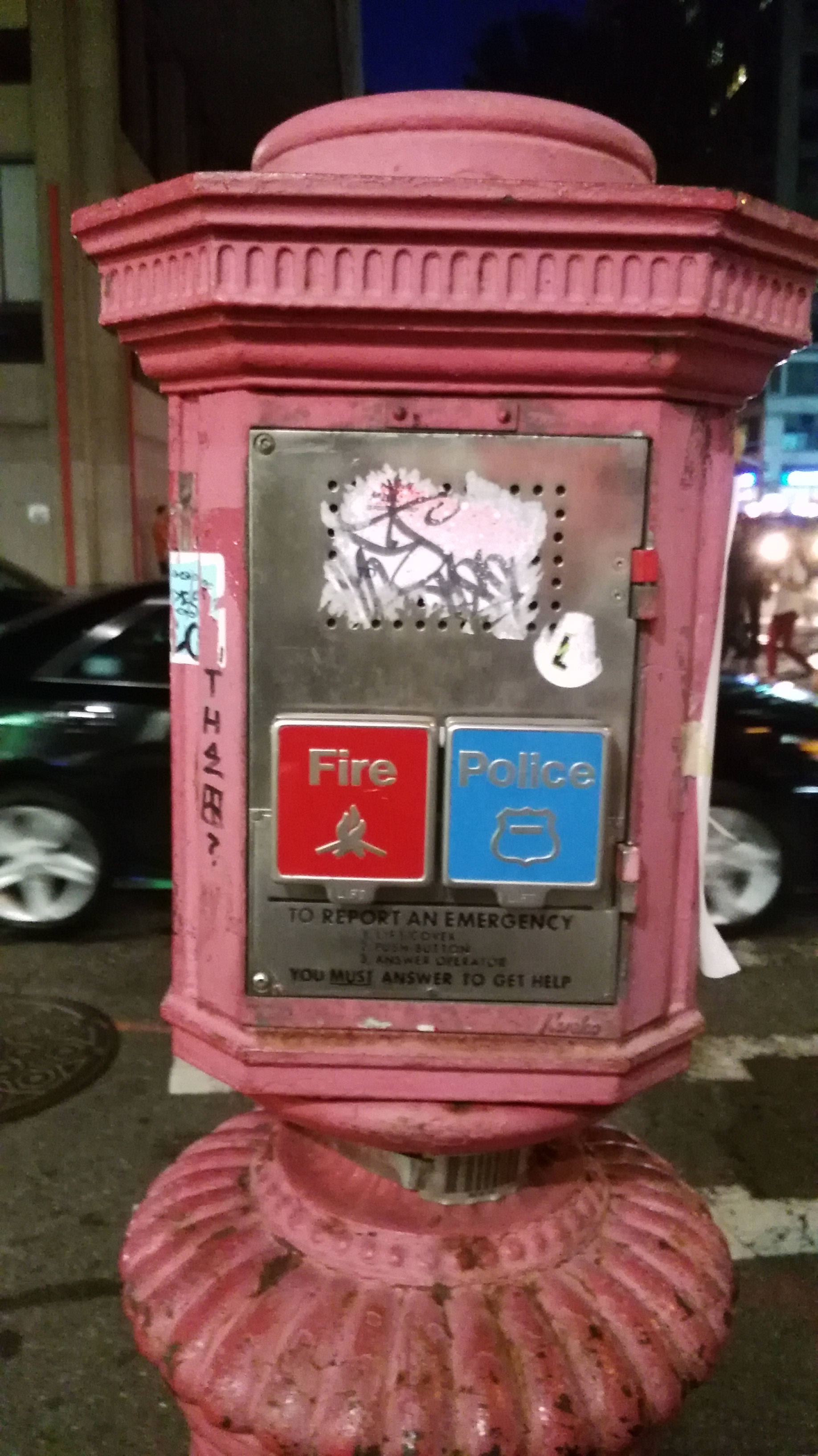
It seems to be a good thing for someone really need help. But here are several things quite terrible:
- The whole system is randomly arranged, I mean, no big signs, no unify signs, but just two small boxes which is easily ignored. Imaging that you are in an urgent situation, can you find this device easily? The answer should be no.
- Instruction is too small. You need to get really close to find the instruction, which will influence your usage and might waste the precious time for report
- Difficulty for use. with the instruction, you need to lift the cover first, and then press the button. I know the case is for protecting the button, but the fact is, when people is in urgent, they will be too nervous to lift anything since it is quite anti-human. And you need to hold the button for a while such that you can keep you online, it may waste lot of time.
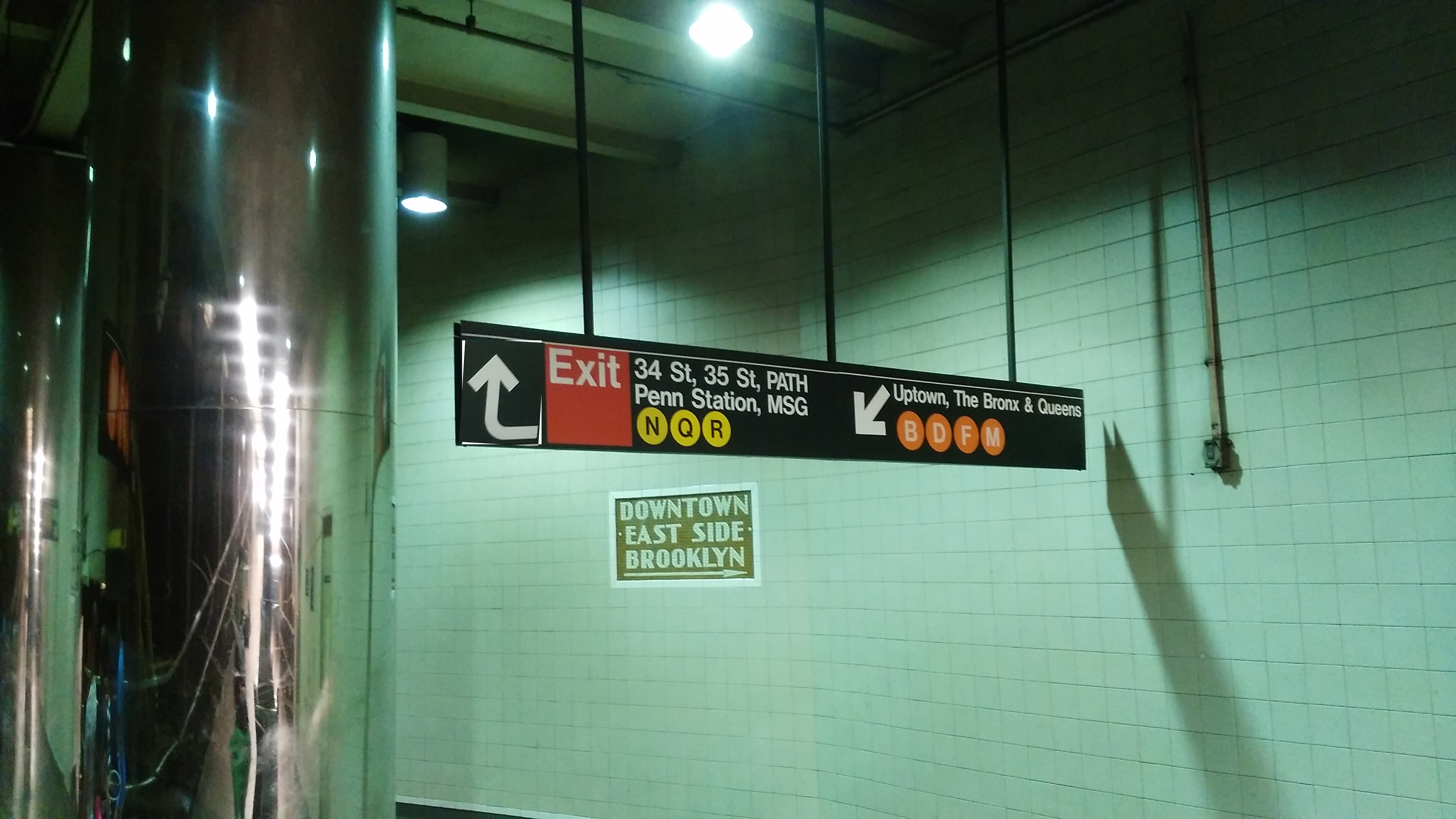
Transfer Arrow

What do you think is the different between those two arrows? For me it seemed no difference that I need to turn left and go down for both site, but the fact is if you want to get Exit, you need to turn left, and then go up!
This is quite easy to edit, just as the following picture does:
The sign I like most
Of course this one:

and
