Last weekend, I went to MET, for the special event “China, Through the Looking Glass”(镜花雪月). Since I’m a native Chinese, it is quite interesting to see what we looks like by the western people. The event is quite good, the combination among Chinese antiques, fashion dresses and movies are so harmony, which exceeded my expectation.
But here I’m not writing a article about that event, I just find the poster of the event is quite interesting, so I want to make it as my analysis homework.
Grid
Basically, the Grid of this poster is simple, just showed as below:
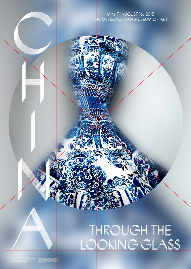
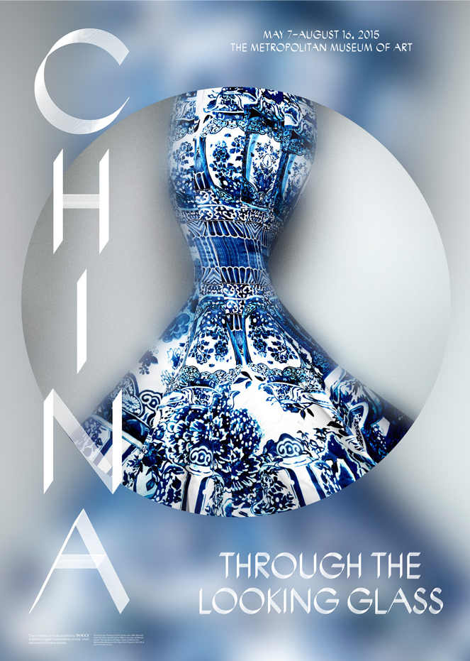
The main body of this poster is the vase-style dress, the clearly circle started at the 1/8 of the height and ended at the 6/8 of the height. The word “China” is in near the 1/4 of the width, and in the middle line, the information of museum, and the first letter “T” and first two letter “LO” are divided. The blurred picture’s center is the same as the clearly dress, and the structure make people focus to the center of the picture, on the waist of the dress.
Hierarchy
For me, the first glance is the dress, since all the elements focused to that point. The second glance should be the word CHINA, then THROUGH THE LOOKING GLASS, then other informations like the MET and the organizations’ name.
typography
The typography of this poster is unique. It designed as the words are duplicated-like and transparent. Maybe this design aiming to imply the feeling like “re-design based on the Chinese antiques” and “Through a Glass”. And such a design looks like a classical bug of Windows as below:
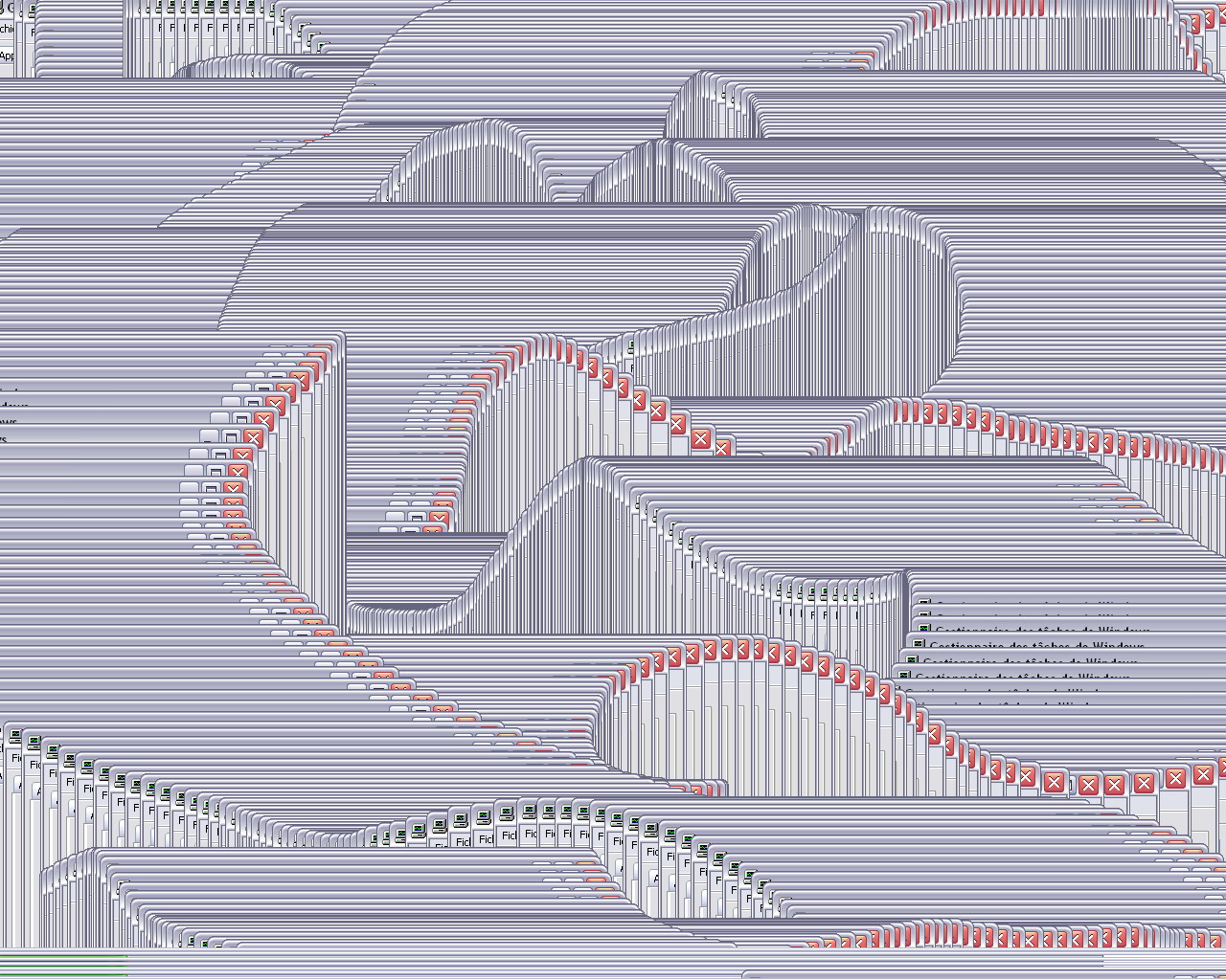
Detailed speaking, we can see the “C” looks like a spin-repeat meanwhile other word like “N” are just move-repeat:


The size-arrangement makes sense, here the “CHINA” is the biggest one, the Title of “through the looking glass” is in the middle size, the MET and other organization is quite small, just as most of the poster do.
color
Since the main body of the poster comes from a certain object, the main color of the poster just stay the same as the color of that object. The word is white, the main body is blue and gray, in order to make a cold, but glass-like texture feelings.
composition
First let’s see what the main body is:

The left side is a ancient Chinese pot, and the right side is a western dress designed as such a style.
Since the exhibition aims to explore the impact of Chinese aesthetics on Western fashion, such a object is quite typical for display. And in order to create a feeling like “Through the looking glass”, the design of the poster tried many elements, like blurred, shape-changed background; shape-repeated, half-transparent words. The design is concise, and the main idea of the design is successfully conveyed.
An interesting thing is, when people see that picture as the first glance, they might see things differently. Most of my American friends told me they think it is a strange dress, meanwhile most of my Chinese friends told me that should be a strange piece of porcelain. And I do think eastern people and western will feel totally different when through such a unique exhibition.