Name
For the name part, I first seeking some typefaces in hand-writing style, in order to figure out the inner-logic of how to create a words without lifting

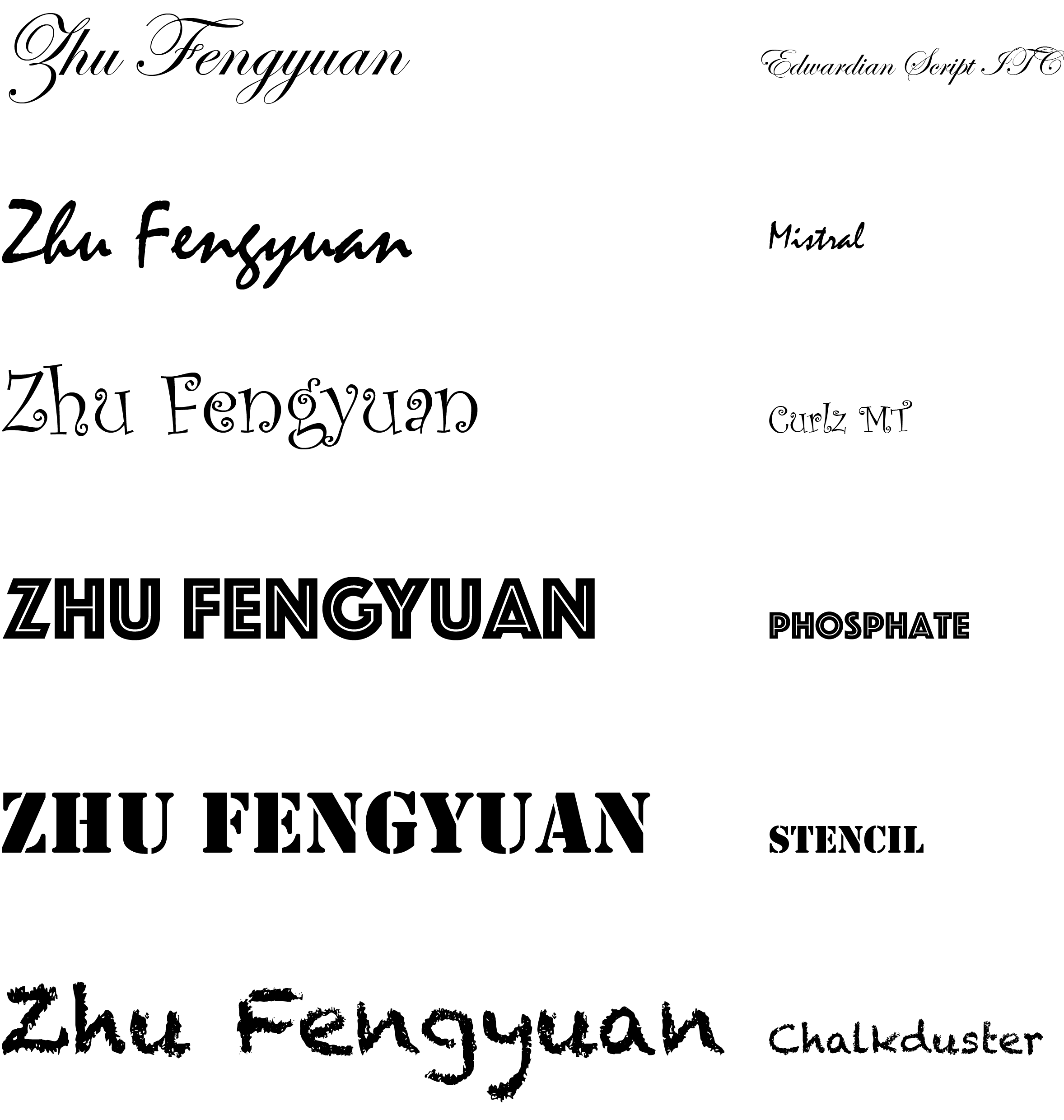
In the Mistral, things goes quite tricky. Instead of creating a ceiling or a bottom line, they make all the lower letters ended in the same place, such that another letter can be linked into that word.

Curlz MT looks so cute, just like the hallow-games. Though the irregular italic of the words lower the readability, but it make the words looks like a childs-painting.

Edwardian Script ITC is quite elegant meanwhile weird, Especially for E,S,Z. I’m not sure why people will create something quite complex, but if we just treat them like art, it is good.
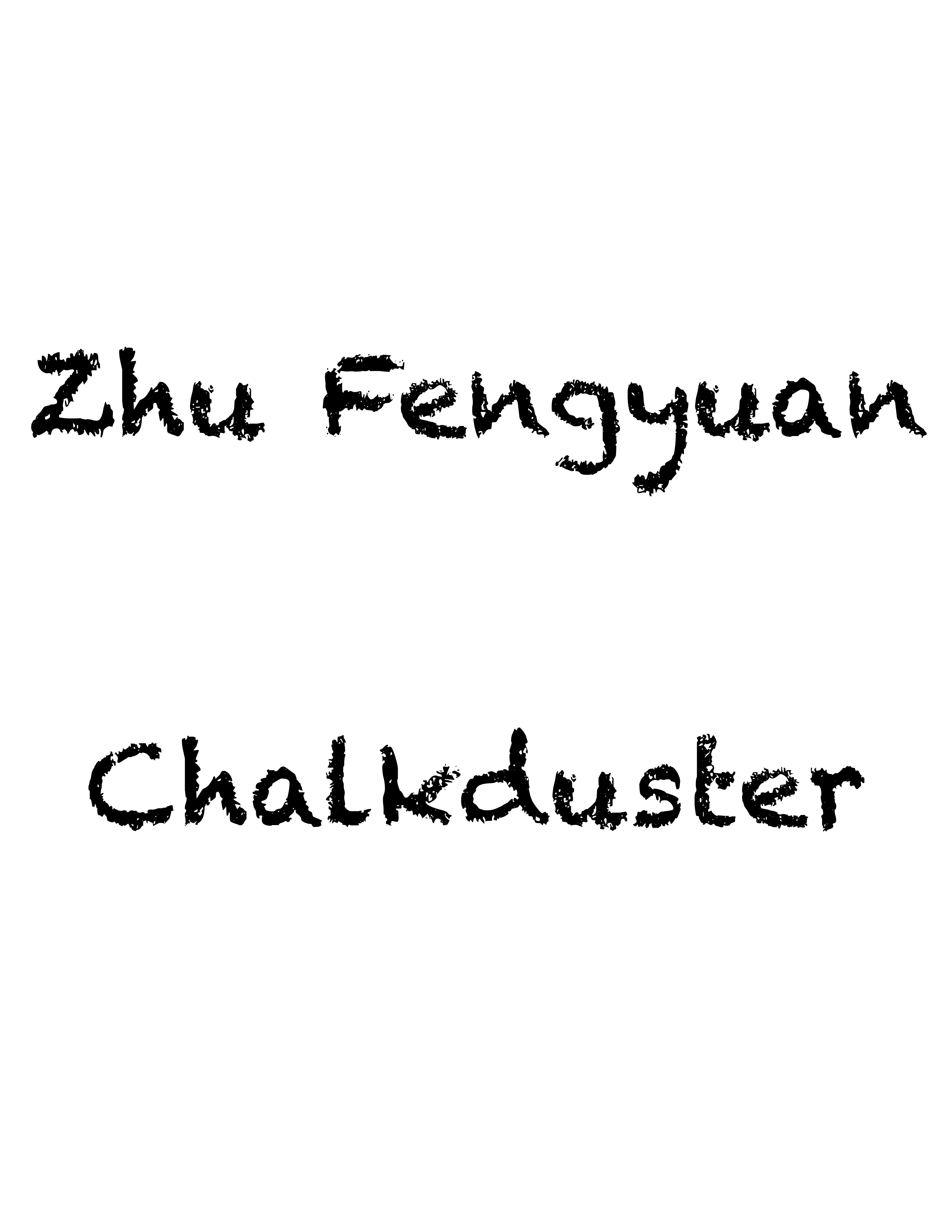
I like Chalkduster because it generate the wade effect like someone writing on a blackboard with chalk. For writing part, it looks like that they cut down of many details of writing, in order to create the real feeling of writing with chalk.
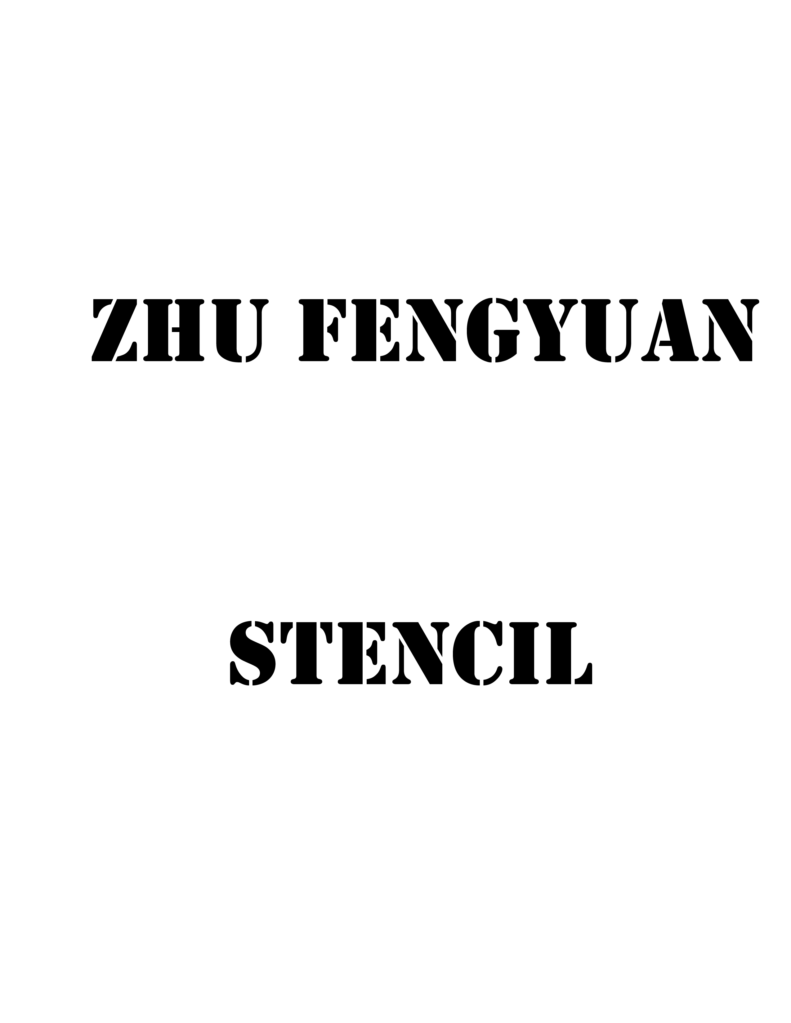
In STENCIL, everything has been cut down, in order to make the word distinct. And the sections seemed unbalanced with a quite thin part with quite heavy part. But with that break inside the characters, the words seemed in good arrangement and even looks pretty tidy.
 PHOSPHATE give me a good feel of lines, of simple but good lines behind it. Though the words is quite fat, it gives me a feeling like it is quite thin and elegant, since the inside white lines are more distinctive and will grab your focus.
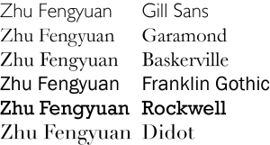
And I tried six-typefaces mentioned in the class. They looked so different. And I like Didot most, and I think that’s why I love ARMANI.
2. Typefaces design

since we are all struggled with PCOM and ICM, I created this, the line of arrangement as below:

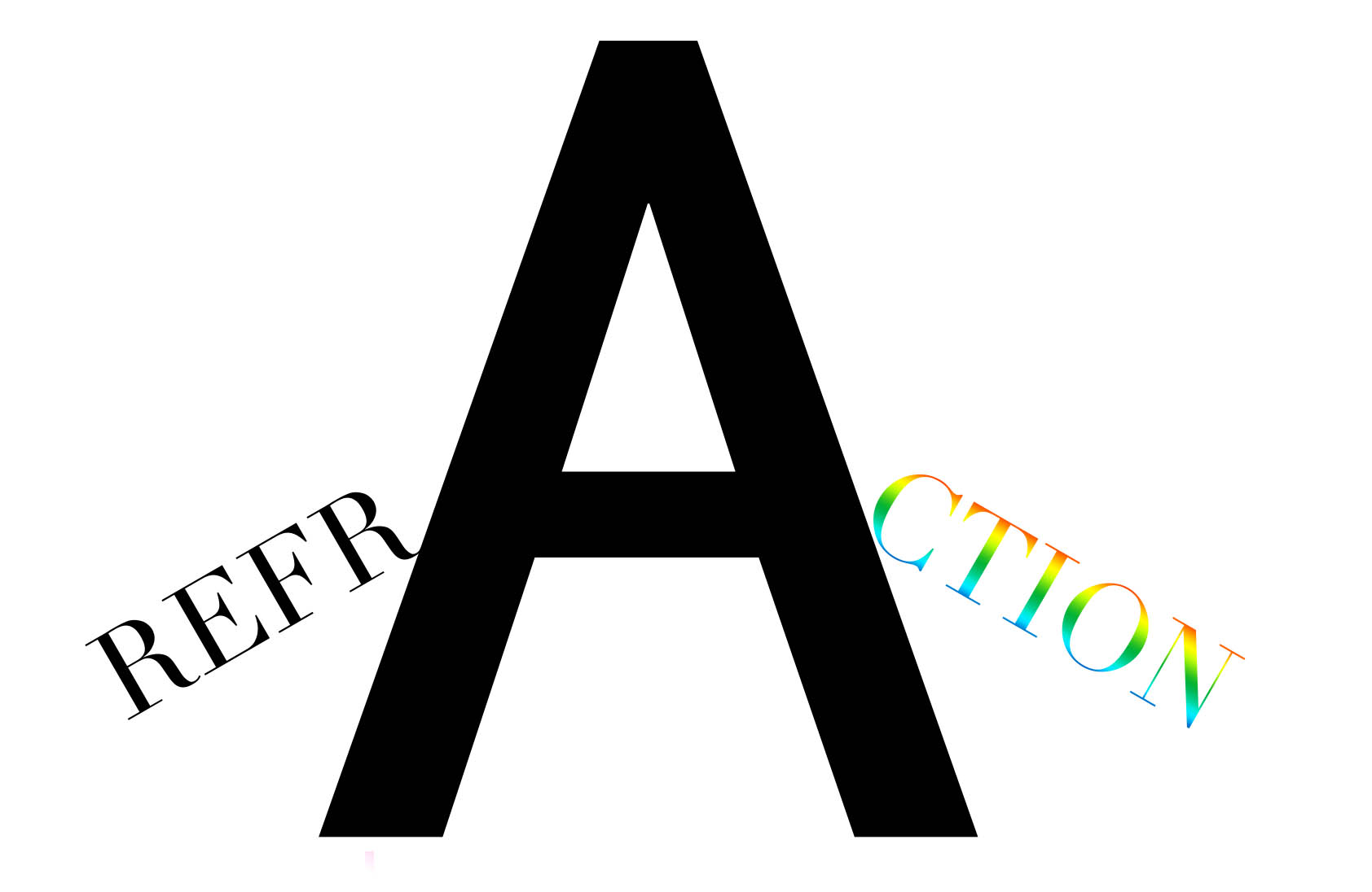
Another thing is for refraction, here I arrange the A as a prism so some phenomena happens here. and I’m not sure if it is proper for I put “CTION” as colorful here.

And a 3D-illusion like that:
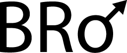
And the feeling when I was been called BRO
And guess what’s the below means:
